BRAND Identity System

GRACE CHURCH
BETHLEHEM

Client
GRACE Church Bethlehem, PA
Year
2026
Brand Identity
Guidelines
Print
Digital Design

GRACE Church Bethlehem needed one identity that could carry everything a church actually produces — a sign on the building, a sermon series every few weeks, a book, the website, a pastor's business card, a Sunday morning post — and hold together when the people using it aren't designers.

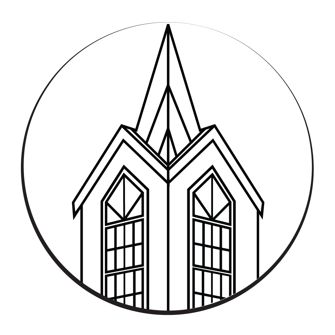
The mark resolves a tension the church named for itself: traditional in substance, modern in clarity. I paired a hand-drawn cross — steady, quietly ornate — with a geometric wordmark set in Gotham, so centuries of tradition sit inside a contemporary frame. I drew the cross to survive scale: it reads on a steeple sign from the road and still holds at 24 pixels as a favicon, which is why it also works on its own as a quiet signature when the full lockup is too much.

Then I documented it. The 2026 identity system is a twelve-section guide covering logo construction and clear space, six misuse cases, a palette built around GRACE Navy on a 60/30/10 ratio with approved pairings, and a full Gotham hierarchy from display down to caption — including a licensing note that specifies Montserrat as the substitute when Gotham isn't available. The goal was to hand staff and partners something they could follow without me in the room.

From there the system rolled out across print and ministry collateral, a sermon series library, event materials, book design, and motion graphics for services.


What I made
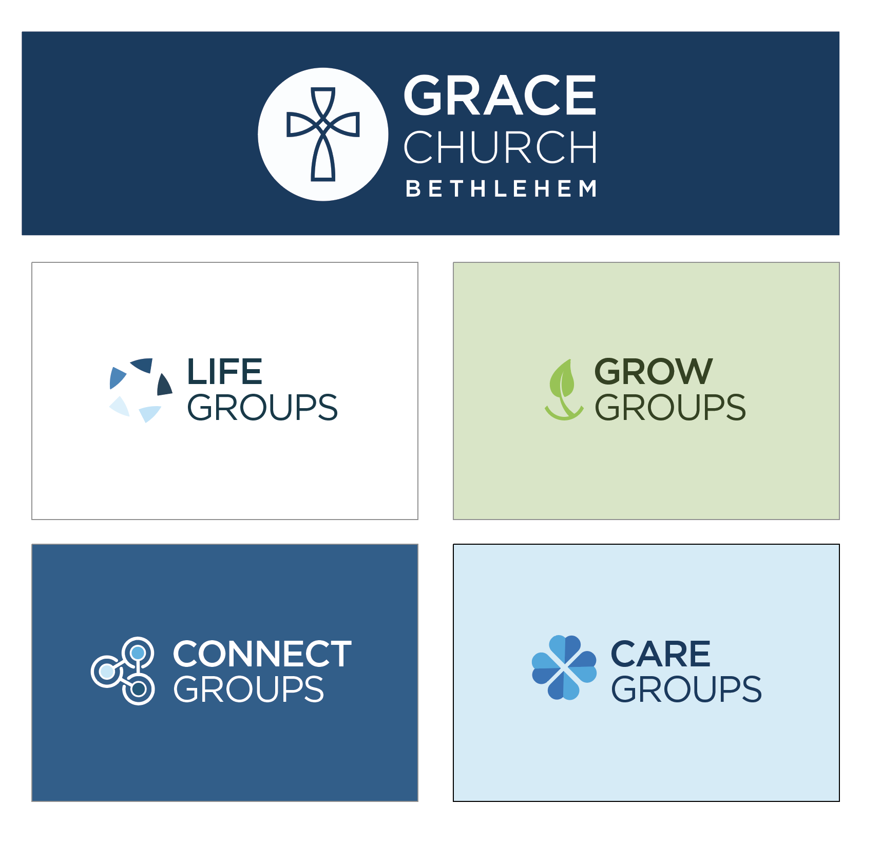
Branding Guide, Logos, Sub-Brands
Website Design
Sermon Series Graphics
Print and Ministry Collateral
Event Materials
Book Design
Motion Graphics
Palette
GRACE Navy
#144e6f
Deep Navy
#063248
Wall Navy
#2a6e99
Chapel Grey
#5d5d5b
Sky
#EEF8FF
Stone
#edeceb
Typeface
Gotham — Hoefler&Co.
Montserrat substitute
Client
GRACE Church Bethlehem, PA
Website

gracecb.org

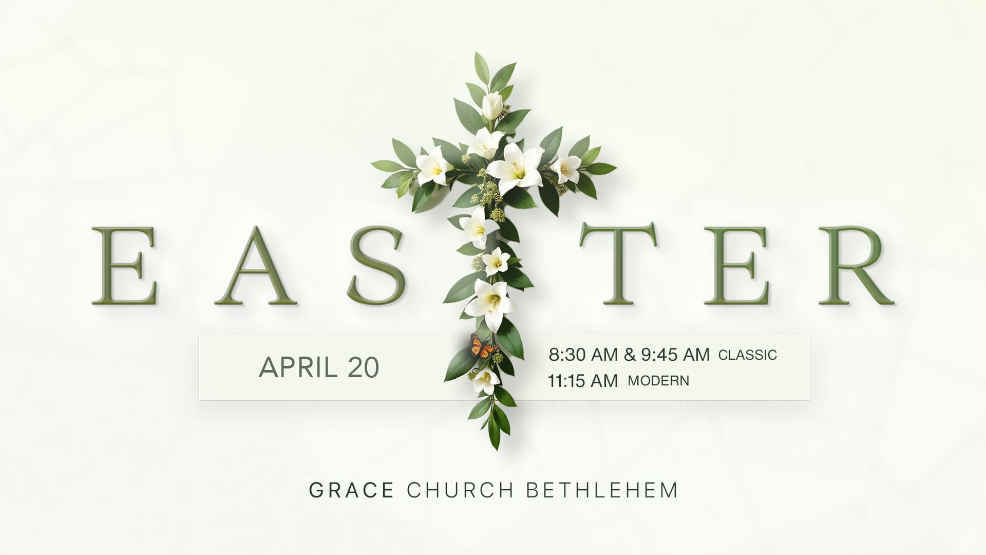
A full site design carrying the new brand identity including worship times and two service expressions, a sermon archive, a searchable group directory, ministry pages from nursery through Grand Adults, and event listings.

PRINT + Branding

The identity applied to the documents a church staff actually produces business cards, officer nomination materials, serve sign-ups. Everything is built on the guide's 60/30/10 ratio: navy leads, pure white breathes, grey punctuates.

Sermon Graphics

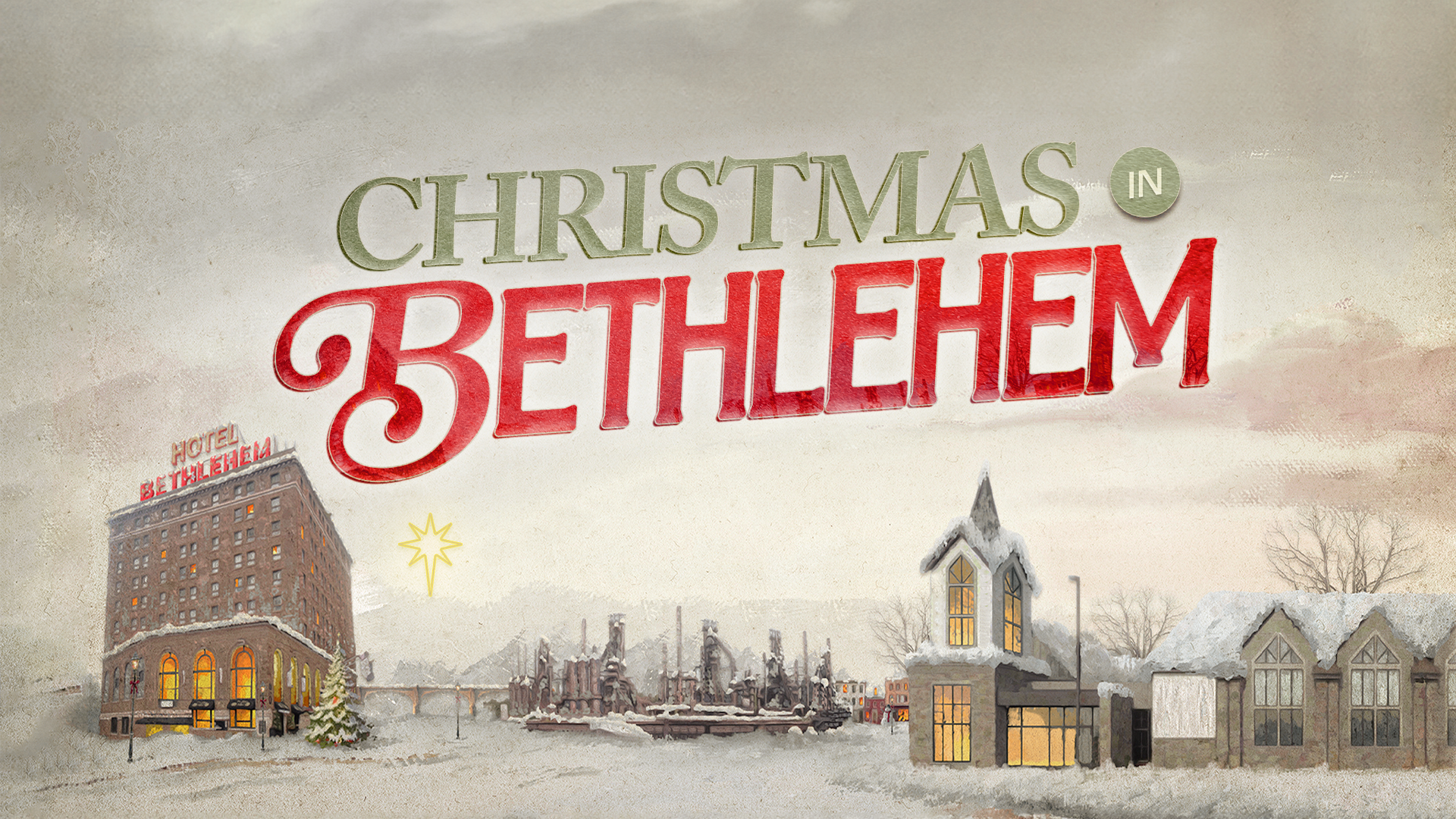
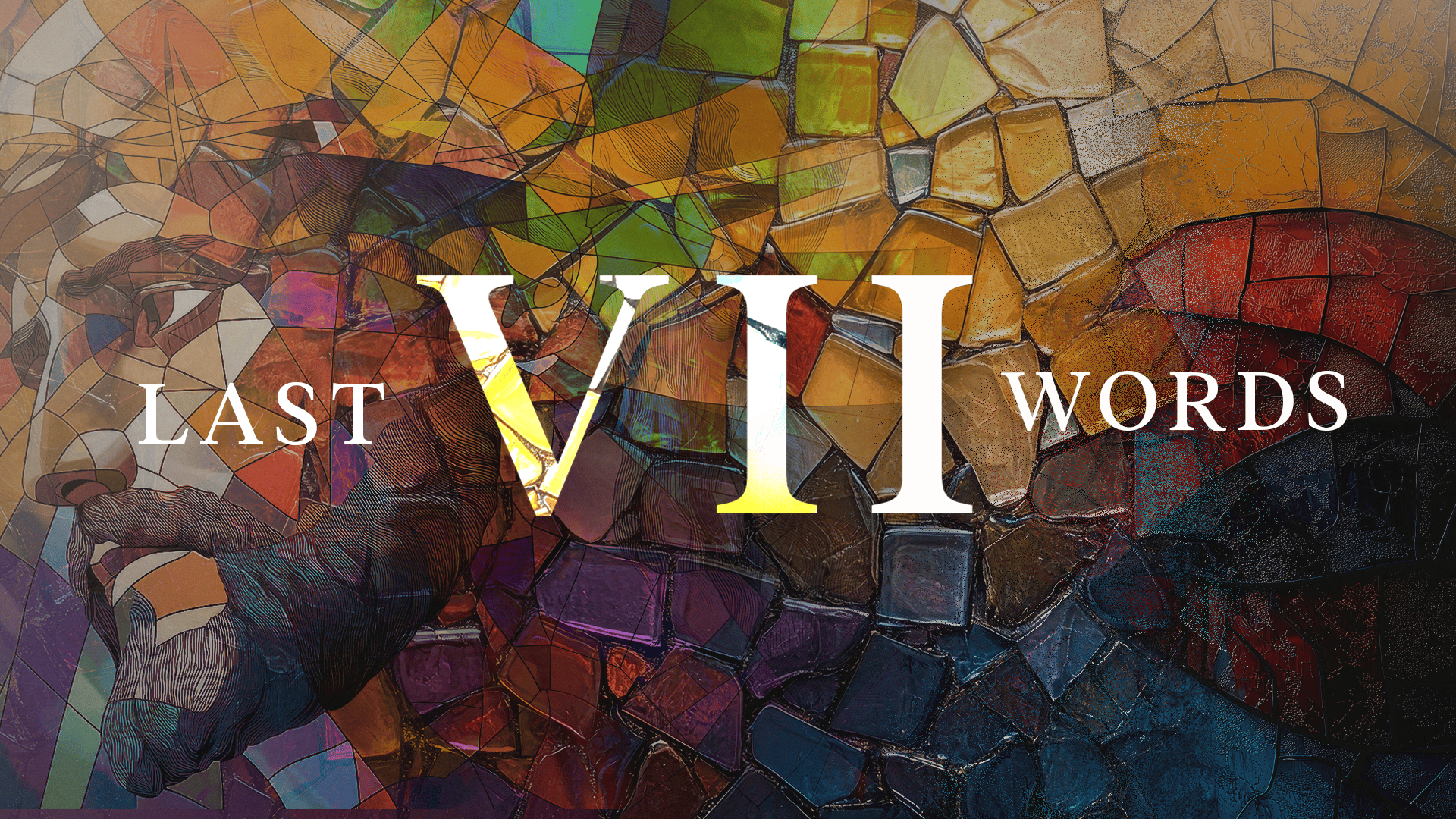
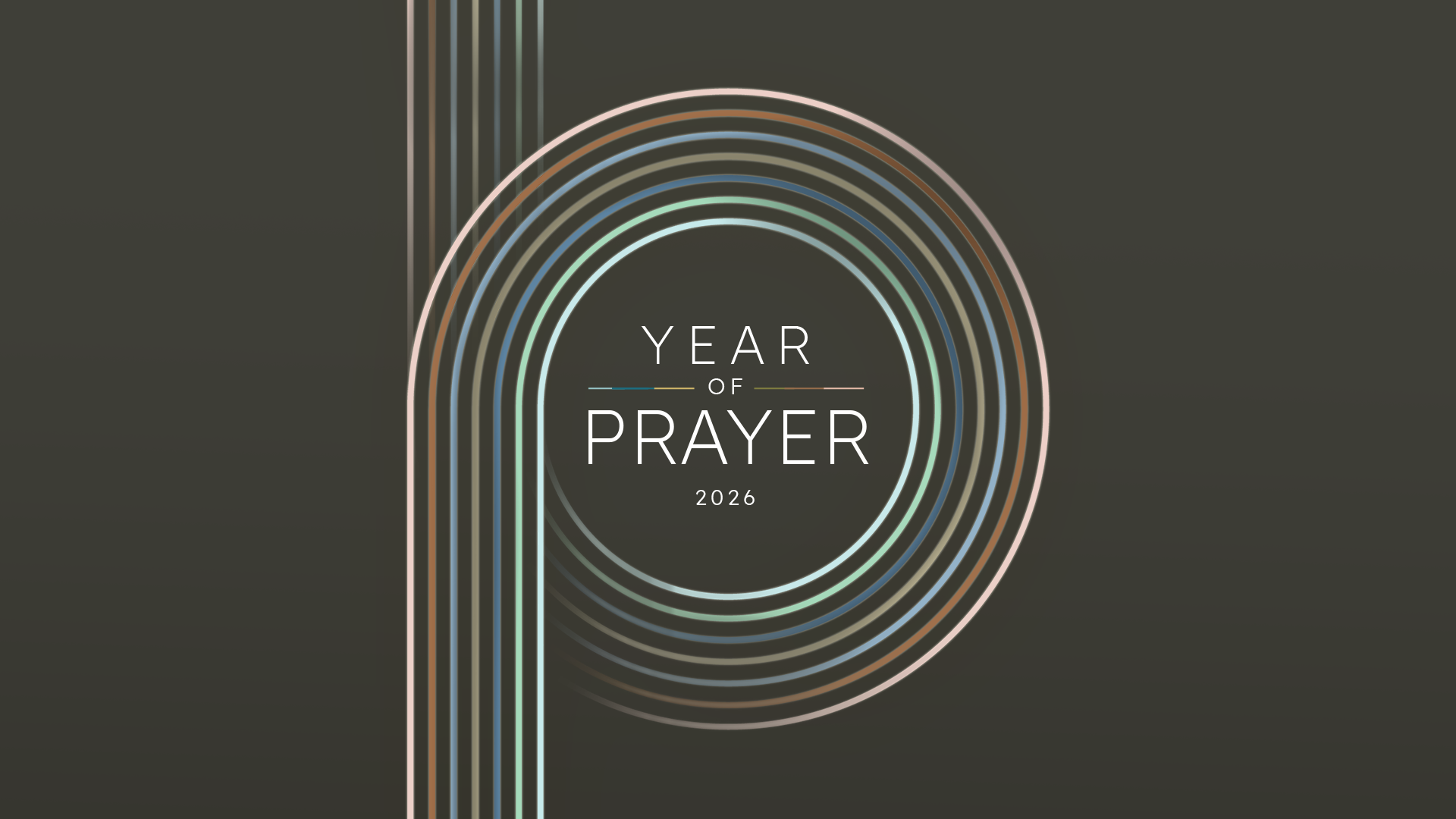
A new series every few weeks, each needing its own visual idea while still reading unmistakably as GRACE. The type hierarchy does the heavy lifting series art changes, the structure underneath it doesn't.

Social Graphics

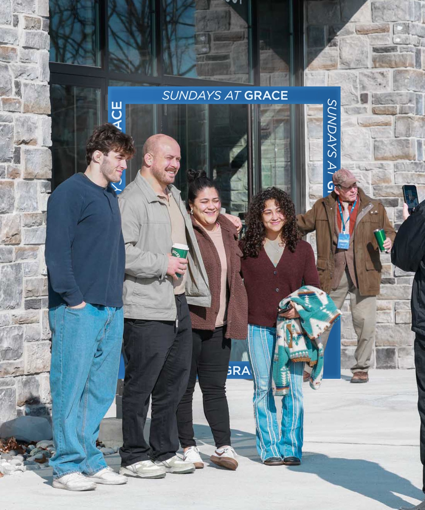
I design every graphic on @gcbgrace reels, announcements, invitations, event promotion, the weekly rhythm of a church feed. Working to a template system means new copy drops in each week without the brand drifting, which is the difference between an account that holds together and one that slowly stops looking like itself.

Animations

Motion graphics for Sunday services and social — the same palette and type hierarchy, moving. Announcement loops and series openers timed to run before a room fills.